How can you build effective customer satisfaction dashboards? How can you transform customer data into information that your teams can use? What are the best practices to put in place, and the mistakes to avoid? If you’re looking for answers to these questions, you’ve come to the right place. This article explains everything, whether you...
How can you build effective customer satisfaction dashboards? How can you transform customer data into information that your teams can use? What are the best practices to put in place, and the mistakes to avoid?
If you’re looking for answers to these questions, you’ve come to the right place. This article explains everything, whether you already have active dashboards in place, or not. Read on for our 7 best practices.
1 – Start from the End-Users’ Needs and Proceed by Iteration
Customer satisfaction dashboards should be designed with the end-users’ needs in mind, meaning those who will use them on a daily basis to steer their actions and measure their impact.
Dashboards are very often not used to their full potential, because they are designed without user input. Yet it is important to fully involve users when producing customer satisfaction dashboards.
Start by drawing up a list of information to display in the dashboards: what dimensions? Which aggregates/key indicators?
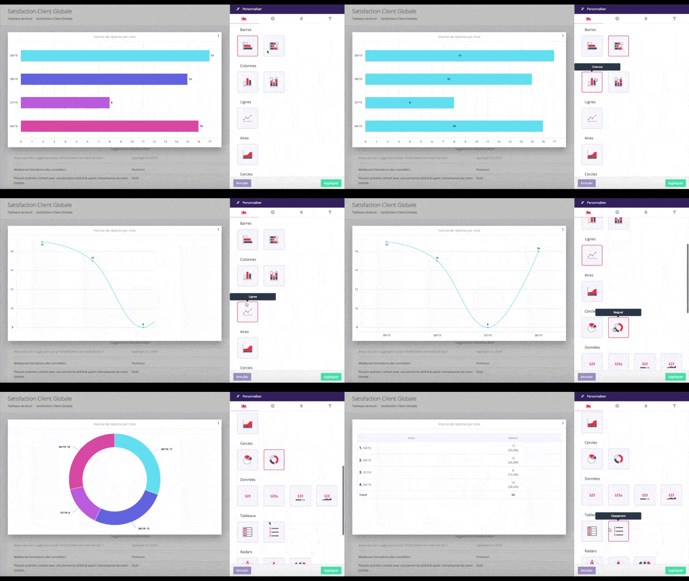
The next step is to choose the most appropriate visualisation methods. Which graphical method should you choose? This depends on the type of data you use.

We will share some precious tips with you on this further on in the article but remember that nobody is perfect. The first version of your dashboard may contain flaws. That’s completely normal. You will gradually identify areas for improvement, both in terms of the type of information to display and how to display it. Take onboard user feedback and proceed by iteration.
N.B: Reporting and steering needs may vary according to users. General management does not require the same level of information as operational users, for example. If you have different families of users, we recommend building several dashboards – one per family.
2 – Opt for a Simple Design
Data Visualisation consists in simplifying the complex, transforming masses of data in readable, quick and easy-to-access information. When designing customer satisfaction dashboards, remember this basic principle: aim for readability and “functionality” over beautiful.
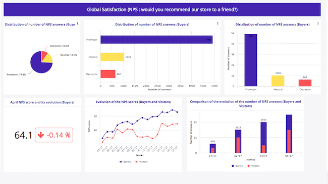
This means not overloading dashboards with useless information (or of little use). Prioritise your information and choose the most suitable graphic presentations. Use easy-to-understand graphics, subtle colours, not too many different colours, etc.
That is not to say that you should always use the same graphical forms. On the contrary, choosing different ones makes the dashboard easier to read and helps distinguish between the different blocks of information. Take the time to explore the possibilities provided by your reporting solution.

3 – Take Inspiration from Dashboards in Other Industries
This article is about customer satisfaction dashboards, but it is also worth looking at other business areas. Why? Because Data Visualisation best practices are the same everywhere, no matter the data you want to display.
Benchmarking will provide you with sources of inspiration and practical examples to apply any general advice you find on the internet (or even in this article). This will feed your design and develop your imagination.
4 – Limit the Amount of Information on Display
A dashboard tells a story. But don’t go into too much detail! Focus on the most important and useful messages. The more information, dimensions and KPIs you add to a dashboard, the less readable it will be. Which brings us back to the basics of Data Visualisation: simplicity. Too much content make dashboards difficult to read (and therefore use).
Only include important information that targets the dashboard’s users. If, for example, you are building a customer satisfaction dashboard for general management, and that your company owns 150 shops, there is no need to detail every shops satisfaction indicator. This would make your dashboard impossible to read. Adapt the level of detail to your users and the dashboard’s purpose.
5 – Adapt the Design to Mobile Devices
Ce n’est pas toujours le cas, mais si vous souhaitez que les utilisateurs aient accès au tableau de bord de la satisfaction client en situation de mobilité, vous devez intégrer cet aspect dans la conception du tableau de bord et faire en sorte que son affichage soit optimal sur les appareils mobiles, par exemple sur la tablette du commercial de terrain. Pour optimiser l’affichage mobile, vous devez appliquer les deux bonnes pratiques que nous avons déjà vues :
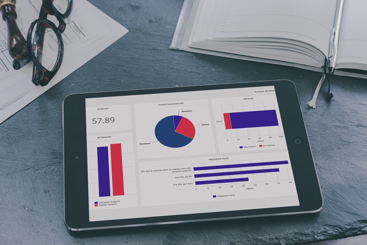
Do your users need to be able to access your customer satisfaction dashboards remotely? If so, this should be taken into account when designing the dashboard, to ensure that the display is optimal for mobile devices, such as on a travelling salesman’s tablet. To optimise your mobile display, apply the two best practices mentioned above:
- Use a simple design.
- Limit the amount of information displayed.
The third best practice is to create a different, simplified for mobile devices.

6 – Prioritise Dashboard Content
Organising a dashboard means, in part, prioritising the information. Everything should not be on the same level. Highlight important indicators and numbers by displaying them in a larger font, so that they catch the user’s eye. You could also play with colours, as long as they remain subtle. This prioritisation helps guide users as they process the content and read your dashboard’s story.
7 – Help Users Read the Dashboard
Prioritisation helps achieve this goal. When designing a dashboard, you should always think about users who are not familiar with them. Your dashboard may contain filtering options. If this is the case, make sure that users intuitively understand how to use these filters. If necessary, add instructions to your dashboard and make sure that your filter names are clear… while making sure to optimise the dashboard display.
There is not much space available, so you need to be able to provide enough information without overloading the dashboard. Similarly, if several parts of your dashboard use the same dimensions:
- Make sure to use the same colour codes in all the content blocks.
- Incorporate a single key for the whole dashboard. This will save space and greatly improve the readability of your customer satisfaction dashboard.
The first version of your customer satisfaction dashboard might not be the most intuitive. As noted previously, it is normal for things not to be perfect from the beginning. Remember to ask your users for feedback, in order to identify improvement areas.
MyFeelback’s dashboard and reporting editor was designed with these best practices in mind. We’ve made things easy, but if you have any questions about dashboards or our solution in general, please feel free to contact us.


