Customer satisfaction is (or should be) at the heart of a company’s main concerns. Building customer loyalty is the best way to secure revenue. But customer satisfaction must be measured before it can be improved. Which is where satisfaction surveys come into play, in all their different forms. Here are a few tips to improve...
Customer satisfaction is (or should be) at the heart of a company’s main concerns. Building customer loyalty is the best way to secure revenue. But customer satisfaction must be measured before it can be improved.
Which is where satisfaction surveys come into play, in all their different forms. Here are a few tips to improve your surveys’ conversion rates. If you follow these recommendations, your response rates will most probably increase two-fold.
1- Design incentive survey invitation emails
To increase the conversion rate of your surveys sent by email, you need to design incentive emails. Your customers will not respond to your survey if the invitation email is unattractive. To get started, here are two simple recommendations to improve your email open rate:
- Pay close attention to the subject of your email: the subject should be clear, not too long, and call to action by establishing a sense of urgency. Prioritise imperative verbs, don’t overuse capital letters or exclamation marks and avoid spam words. For example: “Help us improve our services”.
- Use a professional and explicit email address: preferably a customer service address (customer-service@company.fr).
The contents of your invitation email should “sell” your survey and encourage the customer to take part. Explain the context and purpose of the survey in a concise manner, as well as how the survey will unfold. This makes the customer feel more involved and establishes a relationship of trust.

Don’t forget to include information about the average amount of time needed to complete the survey (crucial for increasing the conversion rate), possibly how the results will be used, the reasons for which the customer was selected to take part in the survey, etc.
One last piece of advice: emphasise how the customer will benefit by taking part (in the form of gifts or advantages) and don’t forget to say thank you at the end. Use a conversational tone, whilst remaining polite and professional.
Below is an example of an invitation email:
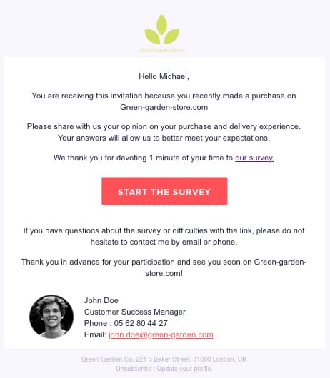
This email includes all the main best practices to be used when designing an invitation email for a satisfaction survey, notably:
- Reasons for the invitation (a recent purchase)
- The purpose of the survey: customer satisfaction with purchase and delivery
- The length: approximately 1 minute
- A thank you note
To take things further, Discover How to write the perfect survey invitation email.
2- Create a climate of trust within the content of your surveys
Reassurance plays an important role in satisfaction surveys’ conversion rates. As suggested by its name, reassurance encompasses all the elements that help to reassure the customer, instil confidence and thus encourage them to act.
Place as many reassurance elements as possible in the body of your email and in the survey itself. Particularly:
- A clear explanation of the survey’s purpose and how the answers will be used. For example: “We guarantee that your answers will be kept strictly anonymous and confidential”.
- The protection of personal data. Insert legal notices as applicable in your country.
- The right to opt-out (unsubscribe) allowing the recipient of your emails to no longer receive satisfaction survey invitations.
- The possibility to contact the sender. For example: “For any questions with regards to this survey”.
3- Pay close attention to your survey’s graphic charter and navigation
Getting a customer to take part in a survey is one thing, getting them to complete it is another. To meet this second requirement, the survey’s presentation must be neat and as professional as possible. It should convey your company’s image. It is therefore advisable to use your company’s graphic charter or at least to insert important items relating to your company or website (logo, colours, style sheets, etc.)
The quality of the layout has a strong impact on the conversion rate; a simple, clear and aesthetically pleasing layout is an incentive factor for the respondent. A sloppy layout will increase the dropout rate when completing the survey. A little suggestion: insert images into the survey to make it more fun and livelier.
The navigation should also be designed to make your survey as simple as possible to read and understand. For example, indicate the number of remaining pages remaining so that the respondent can check their progress at a glance, include relevant navigation buttons, routing functions so that the respondent can skip a question, or even relevant scripting functions.
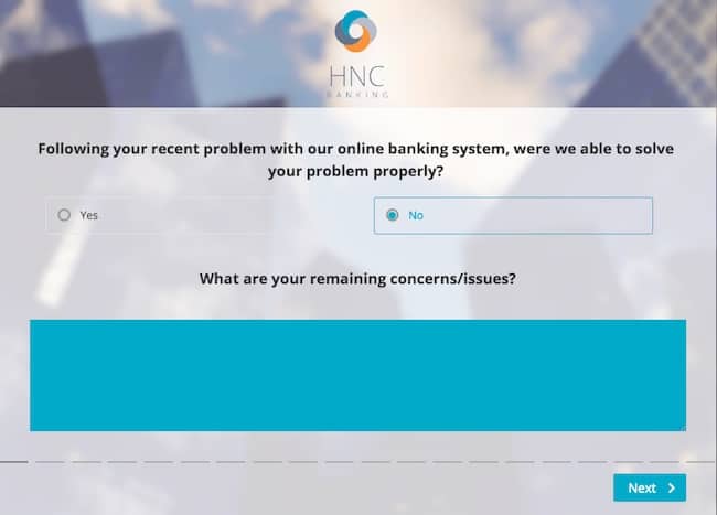
It is advisable to include page breaks every 3 or 4 questions. This gives rhythm to your survey, makes it more dynamic and helps hold the respondent’s attention. Avoid page breaks every two questions; the customer will not appreciate being forced to load 10 pages to complete the survey.
4- Formulate simple and relevant questions
The questions included in your survey should be easy to understand and also as concise as possible. If a respondent is confused about the meaning of one out of two questions, they will unfortunately most likely stop answering partway through. Your questions should be written simply. Simplify the vocabulary, syntax and grammar.
It should also be noted that an endless survey tends to discourage respondents and negatively impact the response rate. Use short surveys (in terms of response time and number of questions), even if this means sending them more frequently, as opposed to one huge annual one.
Focus the survey on one particular aspect whenever possible (quality of service, price, packaging, after-sales service, reception, etc.). If you are addressing two or three themes, remember to include headings inside the survey to lighten it and make it easier to understand.
The order of the questions should also be taken into consideration. Nothing should be left to chance. It is recommended to start with simple and general questions before moving on to more technical and specific questions. Use, for example, the funnel method. The survey’s overall structure should be logical and consistent to facilitate the respondent’s work and their own understanding of the survey.
The bonus: avoid mandatory questions. If the respondent does not know how to answer, or does not want to respond, they will not complete the survey, which is not the aim! Respondents generally answer all of the questions anyway, making mandatory questions all the more irrelevant.
5- Target the survey’s respondents
The target respondents should be defined before even designing the survey or formulating questions.
The principle is simple: your surveys should be sent to contacts likely to be interested by your approach. There is not much point, for example, in sending a survey to customers whose last purchase was made several years ago. Targeting regular customers improves your survey’s performance.

A piece of advice: do not always send your surveys to the same contacts. They may become weary. Use your database to build several sample groups, ensuring that these are representative of your email database or clientele. You could for example use the random selection technique (unless your aim is to target a specific segment of your customer base).
Analysing which contacts do not respond to the invitation (drop-out analysis), is another good practice. This sometimes helps to understand the reasons for abandonment, but also to better determine your survey’s target groups in order to optimise the conversion rate.
6- Provide relevant answer options
You should work on your questions, but also your choice of answers. The answer options should be, just like your questions, simple and clear. The different answers should also be in line with the wording of the questions. For example: a “do you agree” style question should include a choice of answers along the lines of “strongly disagree”, “somewhat agree”, etc. Begin with the negative answers first (not at all satisfied, somewhat satisfied, satisfied, very satisfied).
To make it easier for respondents to choose an answer, but also to allow for a finer and more accurate analysis of the survey results, you should only ask one thing at a time. Avoid questions such as: “Are you satisfied with this AND that?”
One last piece of advice: if you wish to receive answers in the form of ratings, harmonise your rating scale. You should use the same scale throughout the survey.
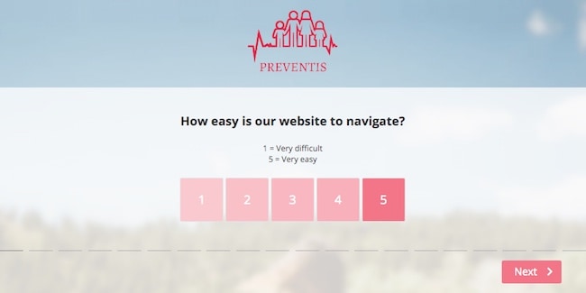
When possible, and if sufficient, opt for binary answers (yes/no; good/bad).
If, despite the above recommendation, you wish to include mandatory questions, remember to add “I don’t know” or “no opinion” to the answers.
To take things further, discover How to Likert scale anwsers types in your surveys.
7- Test the survey on your entourage
To take a step back and ensure that your survey, questions and answer options are relevant, do not hesitate to ask your colleagues, friends or family to review your survey.

This will allow to check the quality of your work, and to ensure that:
- The questions are easy to understand, unambiguous, unequivocal and relevant
- The answer choices are adapted to the questions
- There are no spelling or grammar mistakes
- You have not used complicated terms (overly technical vocabulary, jargon, acronyms, etc)
- The survey follows a logical order and progression and is coherent overall
- The survey is not too long, boring and repetitive
Your colleagues, friends and family’s advice can help considerably improve the quality of the survey and therefore its conversion rate.
8- Send your invitation emails and survey reminders at the right time
Timing is crucial, and it will largely determine your satisfaction survey’s response rate. Your invitation emails must be sent on a day and at a time when you believe that your recipients will be connected and available. It is difficult to give a precise hour and day in this article, because it depends on several factors and varies from one survey to the next. You will need to do your own research, with A/B Testing for example.
Several studies have shown that the majority of survey campaign recipients respond within the first three days following the mailing. It is also worth noting that a customer who does not reply within six to seven days is unlikely to ever respond. Which is why we recommend sending reminder emails on the 6th or 7th day following the first mailing.

You could possibly send a second reminder, but do not go beyond two. In your second follow-up email, specify that this is the final reminder in the subject. This helps to defuse any potential irritation your contacts may feel, and also to establish a sense of urgency.
If you follow these 8 points, your response rate will automatically increase.
But to gain in efficiency when deploying your surveys, it is best to have the right tools. Which is why we strongly recommend that you use Enterprise Feedback Management software.


